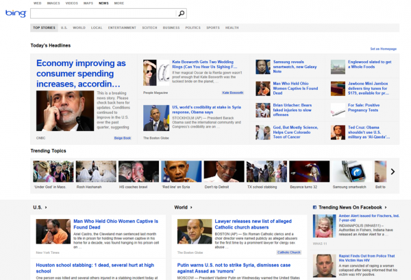
Today Microsoft refreshes the look of Bing News, giving the site a modern makeover that’s more in keeping with the look of Windows 8 and Windows Phone. But the redesign is about more than bringing products in line with each other, the new layout is "built for touch" recognizing the ever-increasing popularity of touchscreen devices -- not just phones and tablets, but also the likes of the Surface Pro and Yoga.
The new look not only embraces touch, but also takes into account the fact that many people use different devices to access the internet -- switching between a phone, tablet and computer is far from uncommon these days. With this in mind, the site now better adapts to different screen sizes.
At first glance the revamped Bing News page is not a million miles away from the look of Windows 8's Start screen but navigation is, for the most part, kept to vertical rather than horizontal movement. The changes are not all cosmetic, and there are a few additions to page content.
The big new feature is Trending Topic which highlights the biggest stories not just from Bing, but also Twitter and Facebook. Perform a search using Bing News, matching stories are highlighted in the news carousel. If you head over to the site and don’t yet see the new look, keep checking back as it may take a little while for the changes to rollout globally.
via BetaNews http://feeds.betanews.com/~r/bn/~3/msAMvstc2Os/
Aucun commentaire:
Enregistrer un commentaire